
Open sky with scattered clouds

Brand Guidelines · Foundations

Alleyoop wordmark

GROUP

GROUP

Elevating every moment.

Foundations.

Foundations.

This is the foundational DNA of Alleyoop Group: the standards, visual elements and guidance for how they come together on every deck, drop, activation and post.

You’ll find our logo system, typography, color palette, imagery, motion behaviors, iconography and voice. Got questions? Reach the team at hi@alleyoopgroup.com.

02

Alleyoop Brand Guidelines

Typography

Two typefaces, two jobs. MADE Outer Sans brings the volume and labels the play; Inter does the talking. Together they read as confident, direct and built for the big moment.

Our typefaces

Our typefaces

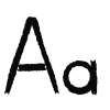
Two typefaces do all the work. MADE Outer Sans is our display and label face: wide, heavy and made for the big moment. Inter is our workhorse for web headlines, body copy, decks and UI.

Display & Labels

Aa

MADE Outer Sans

Headlines, event titles, statement lines, eyebrows and the GROUP in our logo. Extended, heavy and built for volume. Set labels in caps, tracked +8%.

Bold 700

Text

Aa

Inter

Web headlines, body copy, decks and interface. Tight tracking, confident weights.

Medium 500 · Semibold 600

MADE Outer Sans Bold

ABCDEFGHIJKLM NOPQRSTUVWXYZ 0123456789 &?!.,

ABCDEFGHIJKLM NOPQRSTUVWXYZ 0123456789 &?!.,

Everyday usage

Everyday usage

For decks, the website and anything that needs to inform, Inter leads. Pair a MADE Outer Sans eyebrow with an Inter Semibold headline and Inter Medium body copy. Keep hierarchy sharp, copy short and numbers big.

Who we are

We are an extension of your team.

We are an extension of your team.

With 20+ years of experience building brands at the highest level, we accelerate growth, drive awareness and connect every marketing detail to real results.

100M+

Impressions

80+

Influencer mentions

8%+

Average engagement

Expressive usage

Expressive usage

For events, social and campaign moments, type becomes the image. Set MADE Outer Sans huge, stack it tight, crop it against the frame and let the sky show through. Ask yourself: does the type feel like the main event? Things to play with:

Scale

Stacking

Mixed case

Cropping

Contrast

Sky knockouts

The Tip Off · Oct 7

MAKE SOME NOISE.

MAKE SOME NOISE.

Meet the team. Stay for the assist.

Meet the team. Stay for the assist.

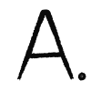
Alleyoop symbol

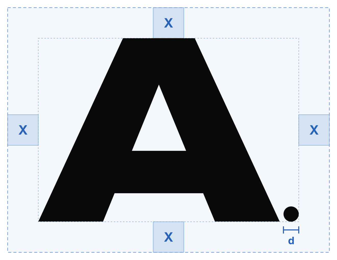
Built in type: MADE Outer Sans at display scale and as labels.

Make some noise social post

Social: condensed display type knocked out over open sky.

Typesetting

Typesetting

Good typesetting takes a discerning eye. These starting points keep our type consistent across the site, decks and social. Large headlines run tight; body copy gets room to breathe.

Style

Typeface

Size

Leading

Tracking

Display

Display

MADE Outer Sans Bold

64–160 px

90–100%

−1% to 0%

Headline

Headline

Inter Semibold

32–148 px

92–110%

−6%

Eyebrow

Eyebrow

MADE Outer Sans Bold, caps

11–14 px

120%

+8%

Body

Body

Inter Medium

14–22 px

120–150%

−2% to −4%

Leading can open up to 100% on display type to keep ascenders and descenders from colliding.

Hierarchy

Hierarchy

Aim for high contrast between levels. The bigger the jump between sizes, the clearer the story. Our web scale uses the same text styles you’ll find throughout alleyoopgroup.com.

Heading 1 · 148

Heading 1 · 148

Elevate.

Heading 2 · 60

Heading 2 · 60

Your complete marketing advantage.

Heading 3 · 28

Heading 3 · 28

Strategy & positioning from the billion-dollar playbook.

Lead · 22

Lead · 22

We help brands break through, scale faster and win.

Body · 16

Body · 16

No two brands are the same, so no two strategies should be either. Together we co-create a custom playbook so you’re not just showing up in the market, you’re owning it.

Eyebrow · 12

Eyebrow · 12

Experiential · Retail · Talent

Incorrect usage

Incorrect usage

Our type system leaves plenty of room for expression, but a few rules keep it consistent. Avoid the following.

We come from the brand side, so we know what it takes to build, scale and win, because we’ve done it.

Don’t set long copy in MADE Outer Sans.

Elevate

Don’t track out headlines.

Elevate every moment

Don’t swap in script or novelty faces.

03

Alleyoop Brand Guidelines

Color

Our palette starts with the sky. Sky Blue sets the mood, Black and White do the heavy lifting, and Haze and Deep Sky add range when a moment needs to feel lighter or louder.

Sky Blue

Sky Blue

Sky Blue is our signature. It comes straight from the open-sky photography that runs through everything we make. The color and the image are one idea. Use it as the dominant field on social and event creative, and as a focused accent on the web.

Primary

Sky Blue

Sky Blue

HEX

#6A98CE

RGB

106 / 152 / 206

CMYK

49 / 26 / 0 / 19

Open sky

Supporting colors

Supporting colors

Black and White bring structure and contrast, and Cloud is our everyday canvas. Haze softens a composition; Deep Sky turns up the energy for nights, launches and big announcements. Use Haze and Deep Sky as accents, and never use both as full floods in the same piece.

Black

HEX

#0A0A0A

RGB

10 / 10 / 10

CMYK

0 / 0 / 0 / 96

Type, logo, contrast

White

HEX

#FFFFFF

RGB

255 / 255 / 255

CMYK

0 / 0 / 0 / 0

Type on dark, space

Cloud

HEX

#F5F5F5

RGB

245 / 245 / 245

CMYK

0 / 0 / 0 / 4

Page backgrounds

Haze

HEX

#AED9EC

RGB

174 / 217 / 236

CMYK

26 / 8 / 0 / 7

Soft accent, covers

Deep Sky

HEX

#2662B8

RGB

38 / 98 / 184

CMYK

79 / 47 / 0 / 28

Energy, nights, launches

CMYK values are conversions for reference. For print, proof against the HEX values and adjust on press.

Proportion

Proportion

Black, Cloud and White carry most of the load. Sky Blue is the signature that makes it ours; Haze and Deep Sky are seasoning. This balance keeps work bold without ever feeling loud for the sake of it.

Black

34%

Cloud

28%

White

16%

Sky Blue

14%

Gradients

Gradients

Our gradients move through the sky, from light to deep and day to night. Keep them bright and clean, and stay inside the blue family so they never turn gray or muddy in the middle.

Sky gradient

Haze → Sky Blue → Deep Sky. For flyers, covers and daytime events.

Night gradient

Deep Sky → Black. For evening events and launch moments.

Accessibility

Accessibility

Legible text starts with contrast. We follow WCAG and aim for AAA (7:1) on body copy wherever we can, and never go below AA (4.5:1). White on Sky Blue only reaches 3:1, so reserve it for large display type and the logo.

Aa

Black on Cloud

18.2 : 1

AAA

Aa

White on Black

19.8 : 1

AAA

Aa

Black on Haze

13.1 : 1

AAA

Aa

Black on Sky Blue

6.6 : 1

AA

Aa

White on Deep Sky

6.0 : 1

AA

Aa

White on Sky Blue

3.0 : 1

Large only

Incorrect usage

Incorrect usage

Small shifts in color add up fast. Avoid the following.

Alleyoop wordmark

Don’t introduce colors outside the palette.

Don’t make muddy gradients.

Strategy & positioning from the billion-dollar playbook.

Don’t set small white text on light blues.

04

Alleyoop Brand Guidelines

Imagery

Open sky and real moments. Our imagery lives between the two: wide, airy clouds that give the brand room to breathe, and close, electric photography from the events, athletes and creators we work with.

Open sky

Open sky

Open sky is our signature backdrop: true-blue skies, soft scattered clouds and plenty of air. Source or shoot it bright and clean, and crop wide so type and logos have room to land.

Open sky
Elevating every moment post

Bright, true-blue skies with soft, scattered clouds.

Avoid overcast, gray or sunset-orange skies.

Avoid heavy filters, fake flares and obvious stock clichés.

Real moments

Real moments

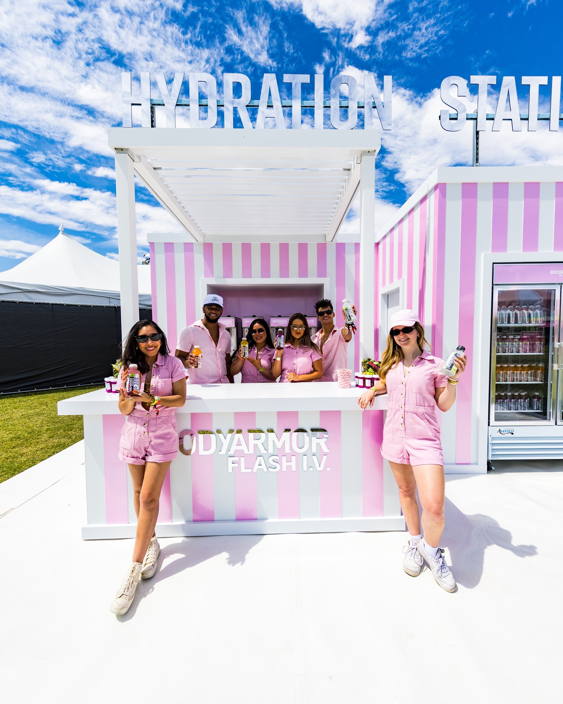
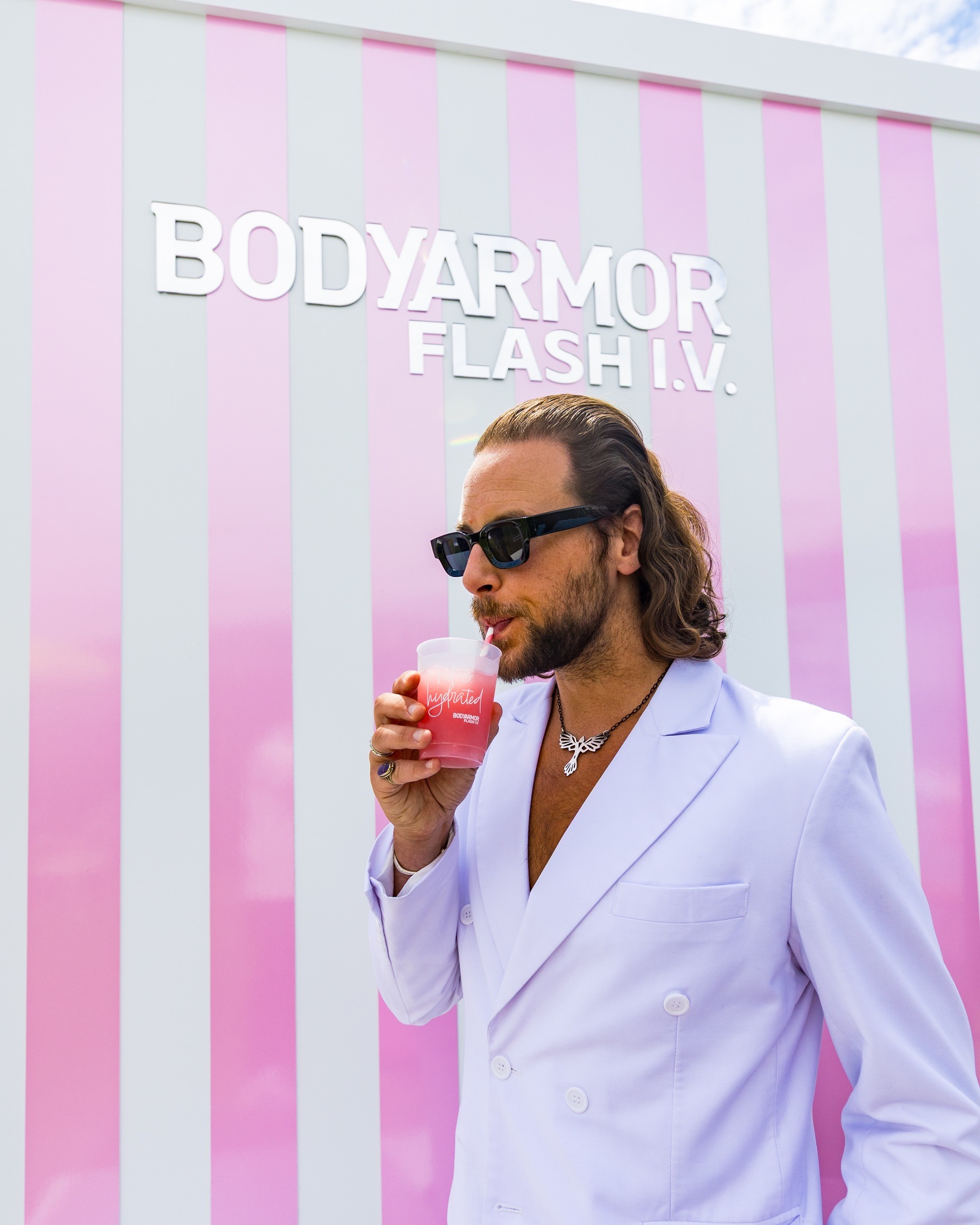
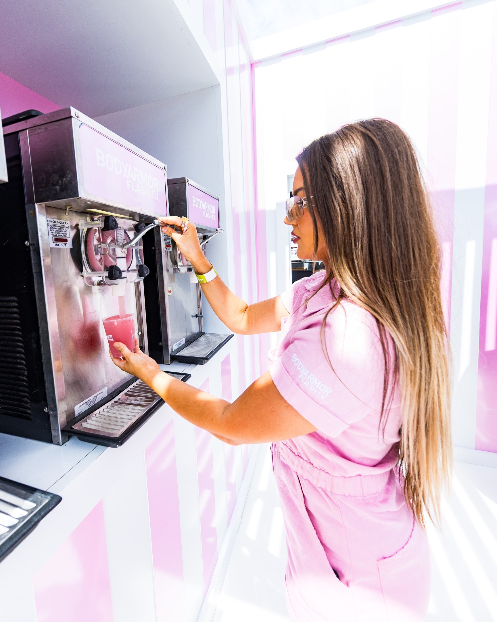
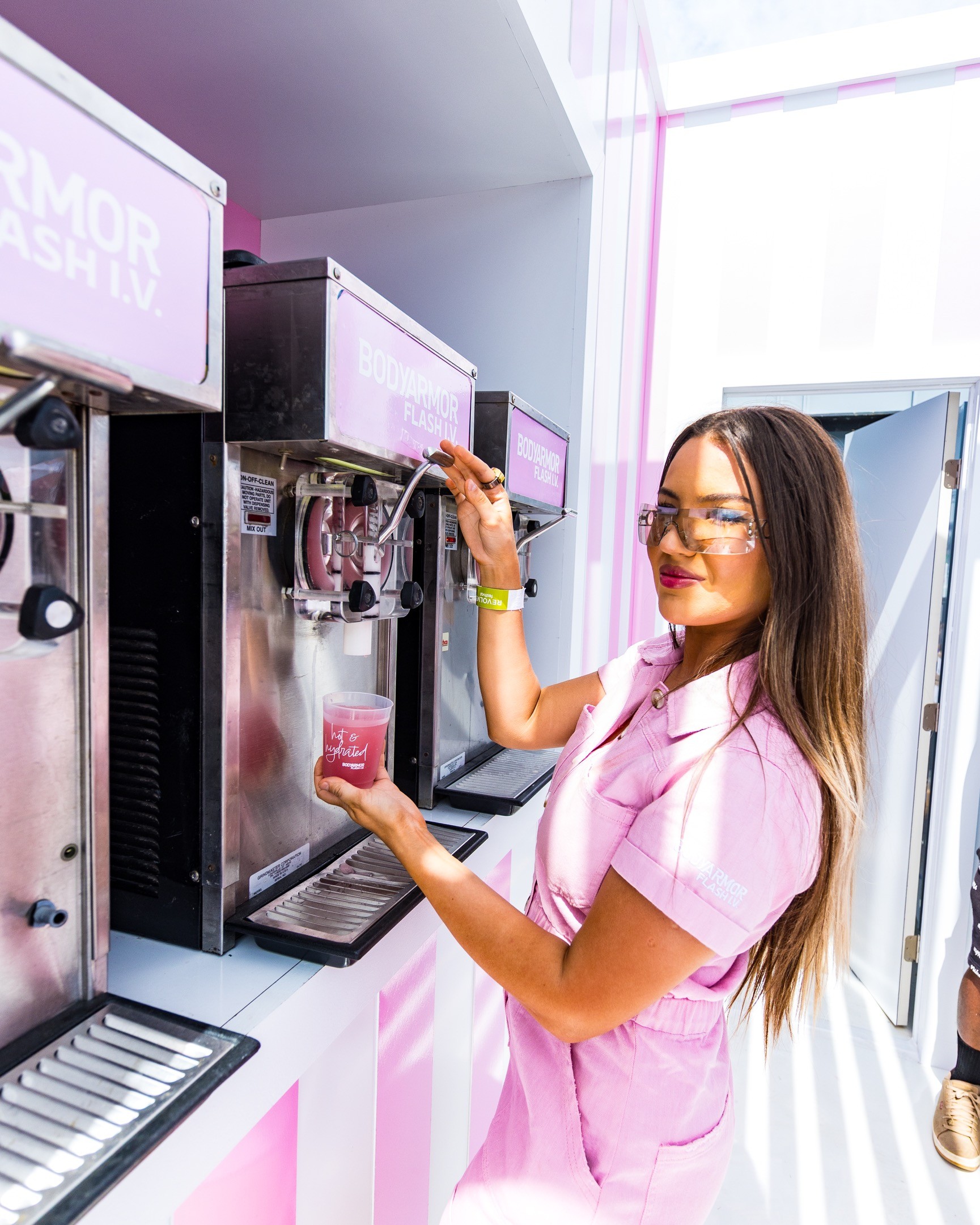
Our photography puts you in the room. Shoot close and candid at activations, courtside and backstage: product in hand, people mid-moment, energy over polish. If it looks staged, keep shooting.

Alleyoop event photography

Close & candid

Get near the action. Real reactions beat posed smiles.

Product in hand

Show the brand being used, poured, worn and shared.

Energy over polish

Motion blur and grain are fine. Flat and lifeless isn’t.

Texture & grain

Texture & grain

Film grain, concrete, grunge walls and printed paper add grit to our cleanest layouts. Use texture as a layer, behind type or over photography, and never as the subject.

Film grain over open sky

Film grain layered over open sky. The grain sits on top; the sky stays the subject.

Highlight cover: grunge wall texture under Haze.

Highlight cover: grunge wall texture under Haze.

Social & print

Social & print

On social and in print, keep one big idea per frame. Service names, event titles and the A. carry the composition; everything else supports it.

Events highlight cover
Talent highlight cover
Work highlight cover
Merch highlight cover

Instagram highlight covers: service names in bold extended type over Haze.

05

Alleyoop Brand Guidelines

Motion

Motion follows the play: the pass, the lift and the finish. Everything moves with intent. Punchy on the way up, precise on the landing, never floaty or indecisive.

Behaviors

Behaviors

Our motion system is built on three behaviors borrowed from the court. Each one has a job: move the story along, build anticipation, or land the point. Everything plays at 12 frames per second.

The Pass

Slides, swipes, marquees and carousels. Moves the viewer between ideas and keeps a story flowing.

The Lift

Rises, scales and reveals. Builds anticipation and brings the hero moment into frame.

The Finish

Landings, snaps and locks. Punctuates a stat, a logo or a call to action, then holds.

Principles

Principles

Motion is always in service of the message, never decoration. Three principles keep everything we animate feeling like Alleyoop.

01

Punchy

Ramp in hard, ease out long. Motion should feel like a quick first step, never a slow drift.

02

Precise

Everything lands exactly where it belongs. No wobble, no rubber-banding, no bounce for its own sake.

03

Human

Anchored in real-world physics: the arc of a lob, the snap of a pass, the hang time before the finish.

Kinetic type

Kinetic type

Type is a major part of our motion. Headlines rise, statements build word by word and hero lines resolve letter by letter out of a soft blur. Every move is stepped at 12 frames per second, so it feels drawn rather than digital. Scroll past each tile to replay it.

Rise

Lines slide up into place.

Build

Words land one after another.

Resolve

Letters rise out of a soft blur.

Easing & timing

Easing & timing

Use these curves and durations as defaults across the site, social and video. Play everything back at 12 frames per second: hold each frame, don’t tween between them.

Name

Curve

Duration

Use for

Lob

Lob

cubic-bezier(0.56, 0.22, 0.05, 0.99)

1.2–2.1 s

Hero reveals, logo intro

Snap

Snap

cubic-bezier(0.96, −0.02, 0.38, 1.01)

0.4 s, 0.09 s stagger

Letter-by-letter type

Assist

Assist

Spring, bounce 0.2

0.4 s

Hovers, UI, page transitions

Float

Float

Ease in-out, mirrored

2.2 s loop

Idle logos and ambient loops

Frame rate

Frame rate

Stepped playback, no in-betweens

12 fps

All brand motion

06

Alleyoop Brand Guidelines

Iconography

Icons are the quiet assist. They label, guide and punctuate, but never compete. We draw them by hand and pair them with the bold typography that carries the brand.

Service marks

Service marks

Our four service marks, Events, Talent, Work and Merch, anchor our social highlights, decks and merch. They’re set in MADE Outer Sans, white, centered on Haze. They’re type, not icons, so never redraw them as pictograms.

EVENTS

EVENTS

TALENT

TALENT

WORK

WORK

MERCH

MERCH

UI icons

UI icons

Our icons are drawn by hand with a rough marker brush, the same way we sketch plays, whistles and checklists in our decks. Keep them in Black or White, one weight, no fills, and always pair them with a text label.

Strategy

strategy icon

Creative

creative icon

Content

content icon

Partnerships

partnerships icon

Events

events icon

Retail

retail icon

PR & Seeding

pr icon

Social

social icon

Merch

merch icon

Style: hand-drawn marker

Weight: one brush, no fills

Grid: 100 × 100

Color: Black or White

Playbook glyphs

Playbook glyphs

The Playbook uses a set of geometric glyphs as bullets, markers and checkmarks, all pulled from our receipt graphic. Use them to list services and steps, one glyph per item, always in Black or White.

✱ ✦ ✕ ▲ ● ◆ ◇ ▶ ✓ ✚

✱ ✦ ✕ ▲ ● ◆ ◇ ▶ ✓ ✚

Our Playbook

ART DIRECTION

●

BRAND STRATEGY

◆

EVENT PRODUCTION

✕

EXPERIENTIAL DESIGN

▲

INFLUENCER SEEDING

✱

TALENT PARTNERSHIPS

✚

Social icons

Social icons

Social icons are white glyphs in black rounded squares, as on our business cards. On dark or sky backgrounds, flip them to black glyphs in white squares. Keep them the same size and evenly spaced in a single row.

Sky

07

Alleyoop Brand Guidelines

Voice & Tone

We sound like a teammate who has already run the play. Direct, confident and a little competitive. We come from the brand side, so we talk like people who build, not people who pitch.

Our voice

Our voice

Our voice stays the same wherever we show up. Three principles keep it sounding like Alleyoop, no matter who’s writing.

01

Run the play

Lead with the point. We never bury the lead or waste anyone’s time. Short sentences, strong verbs, clear next steps.

We are

Direct

Focused

Confident

We aren’t

Vague

Wordy

Timid

02

Talk like a teammate

We come from the brand side, so we talk like people who’ve been in your shoes. Human to human, with no jargon and no agency-speak.

We are

Warm

Candid

Scrappy

We aren’t

Corporate

Salesy

Distant

03

Raise the standard

Good is the floor; we’re hired for the ceiling. We’re ambitious and a little competitive, and we back every claim with proof.

We are

Ambitious

Bold

Proven

We aren’t

Arrogant

Hype-y

Empty

Signature lines

Signature lines

These lines carry the brand. Use them as written. Don’t paraphrase them into something softer.

Elevating every moment.

Elevating every moment.

Tagline: sign-offs, covers, business cards

Attention is not given, it is earned.

Attention is not given, it is earned.

Manifesto: The Standard

Good is the floor. We are hired for the ceiling.

Good is the floor. We are hired for the ceiling.

Manifesto: The Standard

Nobody makes it happen like us.

Nobody makes it happen like us.

Closers and recruiting

Closers and recruiting

Let’s find where you need the assist.

Let’s find where you need the assist.

Calls to action

Calls to action

Meet the team. Stay for the assist.

Meet the team. Stay for the assist.

Events and invites

Events and invites

Tone by moment

Tone by moment

Our voice never changes, but our tone flexes with the moment. Before you write, ask: what should this do, where will it live and who’s reading it?

First impression

Bold · short · playful

Social posts, invites, launch creative, merch.

Sounds like

“Make some noise.”

The pitch

Confident · proof-led · clear

Decks, proposals, the website, case studies.

Sounds like

“20+ years of building and scaling brands at the highest level.”

The partnership

Direct · warm · accountable

Client emails, recaps, reports and check-ins.

Sounds like

“Here’s what worked, what didn’t and the next play.”

Court vocabulary

Court vocabulary

The name comes from the most satisfying play in basketball, and our language nods to it. One court reference per piece is plenty. Let it land, and don’t stack the puns.

Say

Instead of

The assist

Support, services

The playbook

Methodology, framework

Run the play

Execute the deliverables

Tip off

Kickoff

The next play

Next steps

One court reference per piece, used with intent.

Don’t stack sports puns or force a metaphor where plain words work.

Mechanics

Mechanics

The small rules that keep every piece consistent.

Our name

Write “Alleyoop” or “Alleyoop Group” in running copy. Never “Alley-oop”, “AlleyOop” or all caps; caps belong to the logo.

Headlines

End headlines with a period. It lands the point: “Let’s work.” “Elevate every moment.”

Mixed case

In display type, mixed case can add punch (“LET’S work.”), but keep it to one emphasis per line.

Numbers

Use numerals and plus signs for proof points: 100M+ impressions, 20+ years, 8% engagement.

Point of view

Write as “we” and speak to “you”. We’re a team talking to a teammate.

Contact

hi@alleyoopgroup.com for general notes, partnerships@alleyoopgroup.com for new business.

08

Alleyoop Brand Guidelines

Resources

Everything you need to put the brand to work. Logo files, colors and type are listed below. Reach out to the team for source files, templates and anything that isn’t here yet.

Display & Labels

MADE Outer Sans

Text

Inter

Open sky

Need something else?

Let’s work.

Alleyoop symbol
Open sky

Need something else?

Let’s work.

Alleyoop symbol